
Creating a combo chart in Excel is the fastest way to show two related but differently scaled data sets, like monthly revenue and profit margin, on a single chart without one line getting flattened by the other’s scale. This guide covers the exact clicks needed to build one from a normal data table, plus how to fix the secondary axis when a chart looks off.
Key Takeaways
- A combo chart pairs two chart types, such as columns and a line, on the same set of axes.
- Excel’s Insert tab has a dedicated Combo Chart button, so no manual chart-merging is required.
- A secondary axis is usually needed when one data series uses much larger numbers than the other.
- Chart type and axis assignment can be changed per series at any time from the Change Chart Type dialog box.
- Selecting clean, well-labeled data before inserting the chart saves the most time later.
Steps to Create a Combo Chart in Excel
- Step 1: Select the data range to chart, including the column headers and row labels. A table with a date or category column plus two or more numeric columns works best.
- Step 2: Go to the ‘Insert’ tab on the ribbon.
- Step 3: In the ‘Charts’ group, click the ‘Insert Combo Chart’ icon. It looks like a small column-and-line chart combined.
- Step 4: Choose one of the built-in combo options from the dropdown, such as ‘Clustered Column – Line’ or ‘Clustered Column – Line on Secondary Axis’, or select ‘Create Custom Combo Chart’ at the bottom for full control.
- Step 5: In the ‘Insert Chart’ dialog box (opened automatically when ‘Create Custom Combo Chart’ is chosen), find each data series listed near the bottom.
- Step 6: For each series, use the ‘Chart Type’ dropdown to pick the type that fits it best, typically ‘Clustered Column’ for one series and ‘Line’ for the other.
- Step 7: Tick the ‘Secondary Axis’ checkbox next to any series whose values are on a very different scale from the rest, such as a percentage next to a value in the thousands.
- Step 8: Click ‘OK’ to insert the finished combo chart onto the worksheet.
- Step 9: Drag the chart to a clear area and resize it as needed, then use the ‘Chart Design’ and ‘Format’ tabs to add a title, adjust colors, or label the axes.
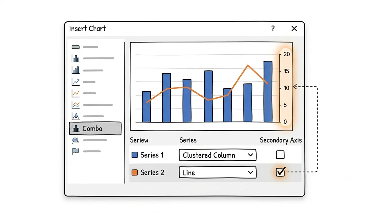
Tip: keep the series with the largest numbers on the primary axis and the one with smaller or percentage-based numbers on the secondary axis. This keeps both trends visible instead of one line hugging the bottom of the chart.
Adjusting Chart Type and Axis After the Chart Is Created
An existing chart does not need to be deleted and rebuilt when the wrong chart type or axis was chosen. Right-click anywhere on the chart, select ‘Change Chart Type’, and the same ‘Combo’ options from Step 5 through Step 7 reappear for editing.

Common Problems and Fixes
- One data series is invisible or flattened against the axis: this almost always means it needs a secondary axis. Right-click the chart, choose ‘Change Chart Type’, select ‘Combo’, and tick ‘Secondary Axis’ for that series.
- The ‘Insert Combo Chart’ icon is grayed out: this usually happens when no data is selected, or when the selection includes blank rows or columns. Reselect a clean, continuous data range and try again.
- Excel creates two separate charts instead of one combo chart: this points to the data being selected in two disconnected blocks. Select the full range in one continuous selection, including headers, before inserting the chart.
- Column and line series overlap awkwardly: adjusting the ‘Gap Width’ under ‘Format Data Series’ for the column series usually resolves crowding between the bars and the line.
- Legend labels show ‘Series 1’ instead of real names: this means the header row was not included in the original selection. Reselect the data with headers included, or edit the series names manually through ‘Select Data’ on the ‘Chart Design’ tab.
Frequently Asked Questions
What is the fastest way to create a combo chart in Excel?
Selecting the data first and clicking the ‘Insert Combo Chart’ icon on the Insert tab is the fastest route, since Excel often recommends a reasonable combo layout automatically.
How many data series can a combo chart include?
A combo chart can include as many series as fit clearly on the chart, though most combo charts work best with two or three series to avoid clutter.
When should a secondary axis be used in a combo chart?
A secondary axis helps when one series has values on a much larger or smaller scale than the other, such as comparing units sold in the thousands against a profit margin percentage.
Can a combo chart mix more than two chart types?
Yes. The ‘Create Custom Combo Chart’ option allows a different chart type to be assigned to each individual series, so three or more types can appear together if the data calls for it.
Why does the combo chart look wrong after inserting it?
This is often caused by the wrong chart type being assigned to a series or a missing secondary axis. Reopening ‘Change Chart Type’ and adjusting each series individually usually fixes the layout.
Does the data need to be sorted before creating a combo chart?
Sorting is not required, but keeping the category or date column in chronological or logical order makes the resulting chart easier to read at a glance.
Can a combo chart be created from a PivotTable?
Yes. Selecting a PivotTable and choosing ‘PivotChart’ instead of a standard chart from the Insert tab still allows the ‘Combo’ option to be selected the same way.
How is a combo chart edited after it has already been created?
Right-clicking the chart and selecting ‘Change Chart Type’ reopens the same dialog box used during creation, allowing chart types and axis settings to be changed at any time.